
Logos play an integral role in a brand’s identity and are often the first visual that comes to mind when a consumer thinks of a company. In the 15 examples below we explore logos that have found a creative use for negative space to further communicate a brand’s imagery and/or messaging.
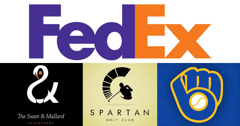
1. The FexEx Logo
![]()
If you look at the white space between the ‘E’ and the ‘X’—it forms a perfect arrow—suggesting a company moving forward and/or looking ahead.
2. The Swan & Mallard Restaurant
![]()
3. The Hartford Whalers (1979-1992)
![]()
The original Hartford Whalers logo (1979–1992), designed by Peter Good, a Connecticut-based graphic designer. The logo combines a green “W” with a blue whale’s tail to create the letter “H” in the negative (white) space. The Hartford Whalers were an NHL team from 1979-1997.
4. The Guild of Food Writers
![]()
5. Spartan Golf Club
![]()
6. Toblerone
![]()
While the mighty Matterhorn is fairly clear, did you ever notice the bear within the mountain? The bear is an homage to the city of Berne, Switzerland, where Toblerone is produced. The bear just so happens to be a symbol of the city.
7. Milwaukee Brewers (1978-1993)
![]()
One of the most recognizable logos in sports, the Milwaukee Brewers yellow and blue mitt logo was introduced in Winter 1977 and adorned Brewers caps for the 16 greatest seasons in club history. The logo was selected among more than 2,000 entries from both professional and amateur designers in an open contest in October and November 1977. Tom Meindel, an Art History student at the University of Wisconsin-Eau Claire, designed the logo and earned the $2,000 first prize. The logo combines the lower case letters “m” and “b”, the club’s initials, to form a baseball glove. [source]
8. Safari Into Africa
![]()
While the elephant is unmistakable, check out the negative space between the elephant’s legs, which forms an outline of Africa.
9. Via Rail
![]()
If you look at the white space between the ‘V’ and ‘I’ and the ‘I’ and the ‘A’ you’ll notice two parallel lines representing railway tracks. The logo also looks the same if you rotate it 180 degrees.
10. The Pittsburgh Zoo & PPG Aquarium
![]()
11. Feathers & Fur Pet Store
![]()
Which did you see first, the bird or the dog?
12. Martini House
![]()
13. NBC
![]()
The iconic NBC logo has a peacock in white with six colourful feathers representing each division of NBC (when the logo was originally designed in 1986, as there are more now): News (yellow), Sports (orange), Entertainment (red), Stations (purple), Network (blue), and Productions (green). The peacock is also looking to the right, often associated with looking ahead or forward.
14. Yoga Australia
![]()
The outline of Australia can be seen in the negative space between the arm and leg.
15. The Bronx Zoo
![]()


