Pie charts can have an elegant way of transforming data into a something that is easy to understand and visually appealing.
Sometimes, they go one step further—literally looking like the thing they’re trying to represent.
Okay that last sentence was clunky and confusing. Better to use pie charts to get my point across!
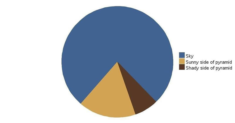
1.
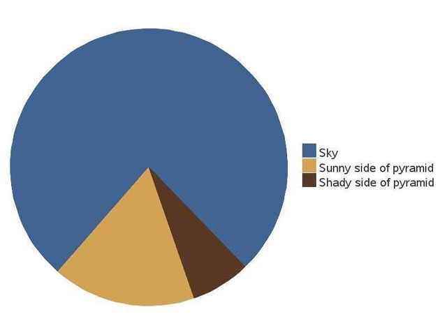
2.

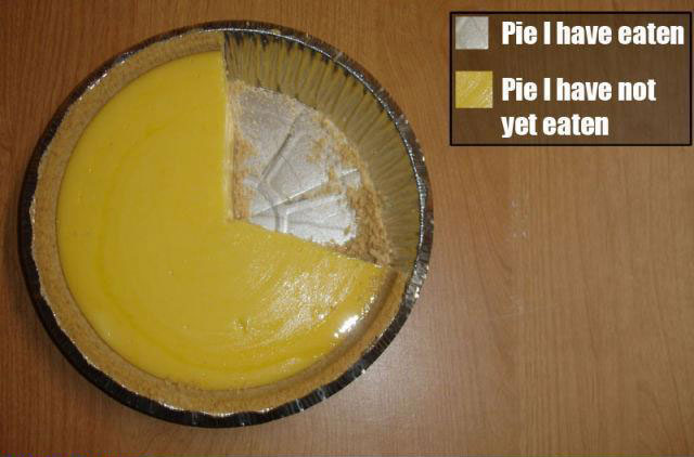
3.
4.
5.

*Double Bonus*